Turning a new leaf.
Brand and website refresh.
Brand identity refresh and a new website for Prevar.
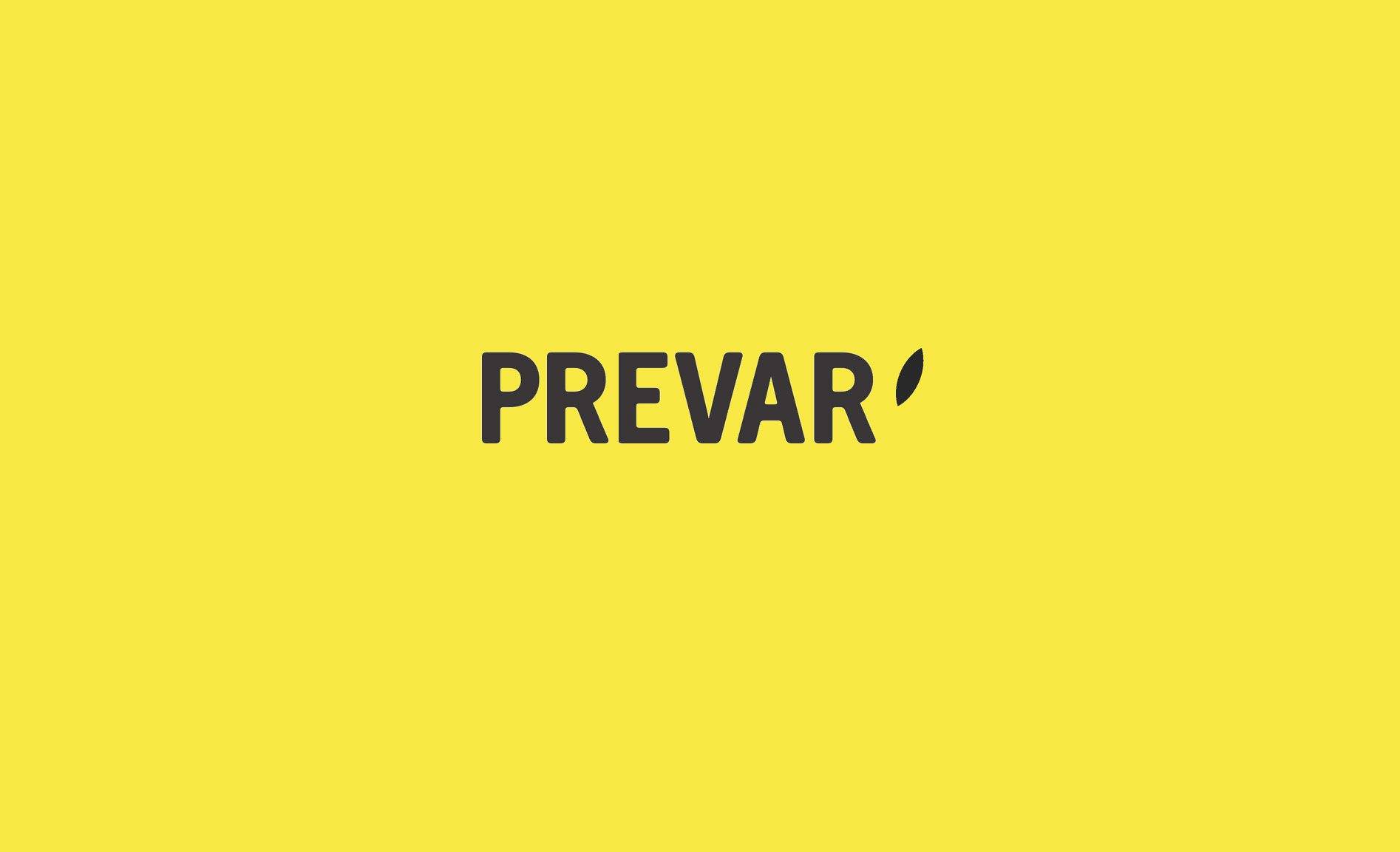
The leaf or pip that punctuates the wordmark is a nod to the illustrated leaf on their original logo. In this interpretation, however, the leaf or pip is suggested rather than illustrated and – together with a significant change in the supporting colour palette and typography – helps create a more confident and contemporary identity for the company’s future.
The website feels big and bold, oozing the confidence that comes with the successful global commercialisation of new fruit varieties.

