Thinking forward.
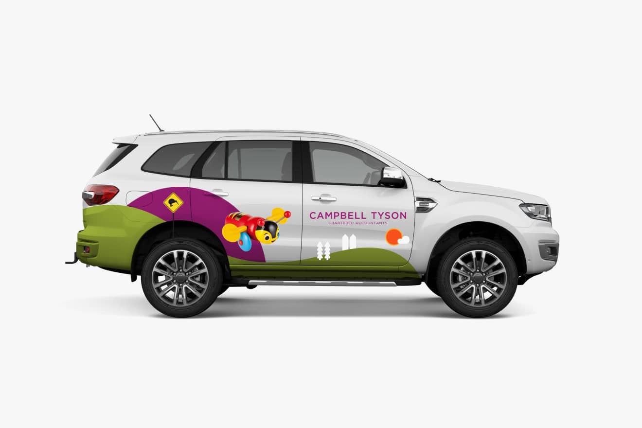
Brand refresh for Campbell Tyson
Campbell Tyson asked us to refresh the brand work we created some years prior. They still loved the original brand work, but they were moving one office into new premises and wanted us to design a new website. They were keen to ensure the brand would remain fresh and up to date for years to come.
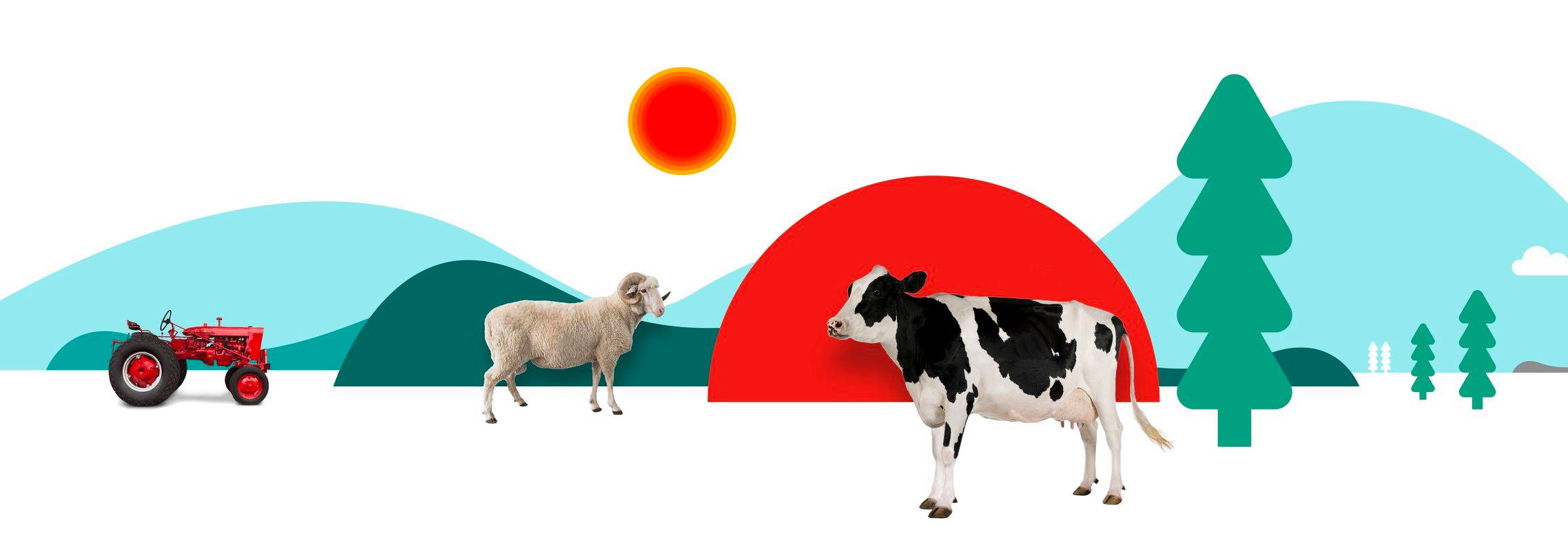
We increased the number and strength of the vector brand elements used in the original brand illustrations while reducing the density of image use overall. The original illustrations were purposefully a touch “in your face” with a slightly raw feel. The new style feels more resolved, being slightly more sophisticated and elegant compositions.
The new and highly distinctive “representative environments” reflect the firm’s mix of “town” and “country” clients. The composition balance of each illustration can also easily be changed to suit the intended target audience for specific applications.