The same. But different.
Brand Work for Fisher & Paykel
A new B2B brand for the global appliance manufacturer Fisher & Paykel.
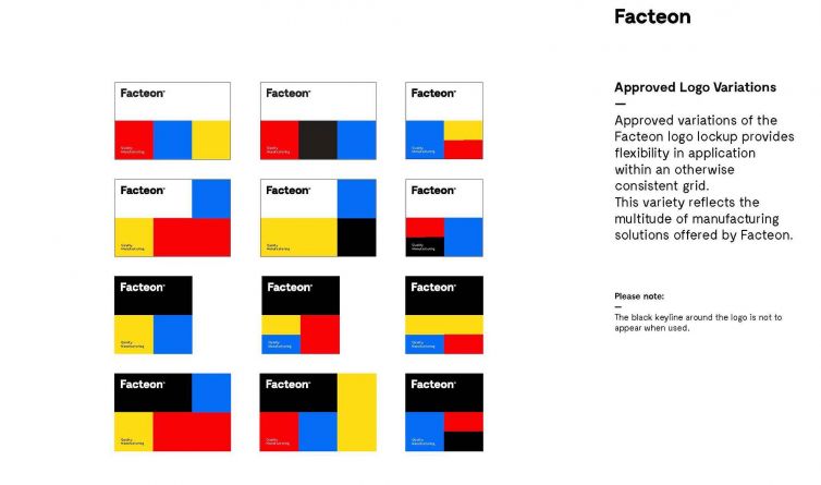
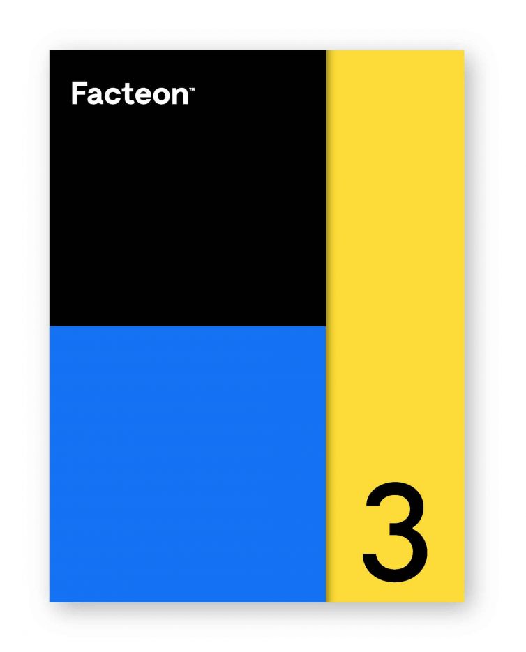
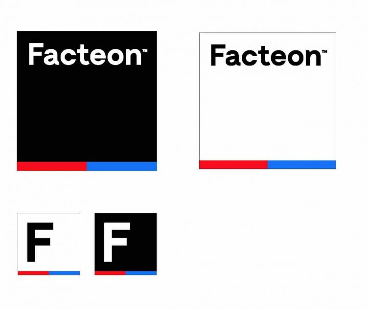
There were a number of core logo variants approved for use that are consistent in their design but vary in their configuration and use of colour. This dynamic quality helped support Facteon’s positioning as an energised brand and innovative partner. Yet at the same time, even though they vary in appearance, they remain highly distinctive and instantly recognisable as the Facteon logo.

